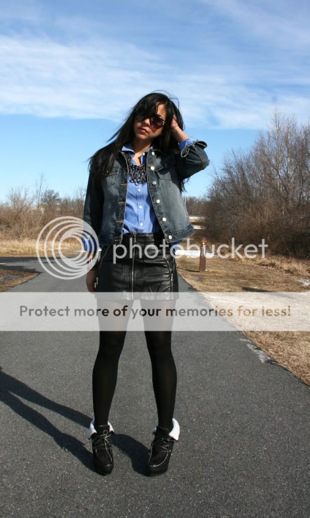
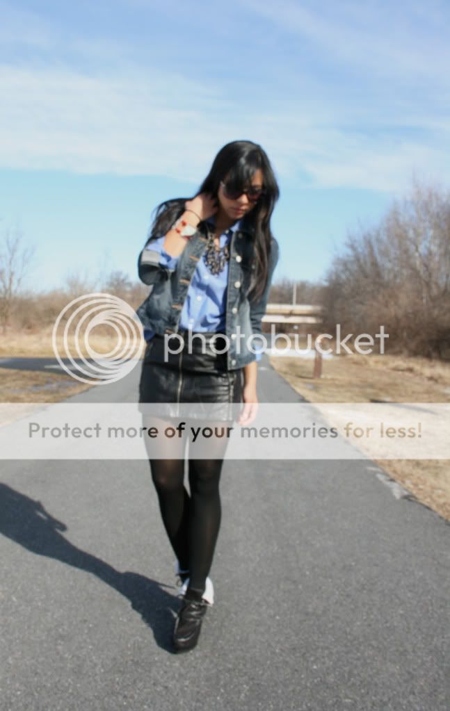
Jacket and button up- Thrifted, Skirt- Rainbow, Necklace- Laila Rowe, Booties- UrbanOG.com
My cousin is taking time out of his busy schedule to design a logo/website for the store and just sent me a draft with a few options. I love the font and I think the monkey is adorable! (definitely beats my kindergarten looking sketch at the top) I can't decide on the placement/size of the bow, or whether to have a bow at all (I know, really weighty decisions). The idea is to strike a playful balance without venturing into cuteness overload. Also, the "let them wear cake!" was my cousin trying to pull a phrase from one of my blog posts to be a tag line. While I appreciate his effort, I don't want you to actually wear cake, dear readers, because that would imply you're not wearing the best quality vintage!
I decided to do a little brainstorming. First, I made a list of all the words/phrases I could think of that start with "V" (I have a thing for cheesy syllogisms).
Vintage, vavavoom, voluptuous, velociraptor, vomitrocious, vivacious, volume, vain, vicarious, villain, vixen, Victoria Beckham, velocity, vintriloquist...
Okay so that wasn't going anywhere productive. Then I tried coming up with even more terrible tag lines:
Vintage for sexy monkeys!
You vintage animal you! (awkwaard)
Vintage for the animal kingdom! (But it's supposed to be for people!)
We don't monkey around with vintage...
Monkey see, monkey buy vintage. (Oh lord, enough with the monkeys...)
So you can see that I need your help! I would appreciate a comment with your vote for favorite logo/ ideas for improving it. Also, any non-awkward catch phrases using the word "vintage" are welcome! Actually, still send the ridiculous ones, it'll be entertaining :) Thanks!


My favorite design is B, I like the bow on the side a bit!
ReplyDeleteI'm not sure if you need to have monkey/animal in the tagline, because a lot are awkward sounding I think the best tagline is We don't monkey around with vintage, because it has the monkey but it doesn't apply the readers are monkeys/animals
As for making up one, I am quite horrible at it, but I will think about it!
About the logo ... I like a combo of B and C. I prefer that adorable lil monkey with the bow on the top middle of her head, like it is in C. I also love how the heart above the "i" in "petite" is pink in C. But I prefer how it's all laid out in B.
ReplyDeleteI will attempt to brainstorm the tag line. Will be back soon, hopefully!
I like B. Sorry I can't help with the tag line.
ReplyDeletei love the second one! its so adorable
ReplyDeletewww.littlemissdressup.com
divine beauty! Cool blog, very personable and nice here.
ReplyDeleteI follow you witch
Adam,
http://fashionispartofme.blogspot.com
I really love the look, that skirt takes it to a whole new level of coolness!
ReplyDeletexx
Nice outfit dear!Especially like the leather skirt and your shoes,they look awesome!
ReplyDeletehttp://nothinglikefashion.blogspot.com/
Great outfit!! Love the layering and necklace
ReplyDeleteBoxmoonbabble.com
I'm lovin B but with the bow on top! this outfit is so awesome. love the semi tucked shirt the denim jacket and leather skirt!
ReplyDeletetagline suggestions (that are absolutely horrible): Vintage not monkey business :)
I choose B defenately! loving the outfit, what an awesome skirt! <3
ReplyDeleteI think B, like how it all fits together! Cool outfit too :)
ReplyDeleteI actually really like C or B. I kind of like C better, to be honest, but I see that everyone has said B, so now I'm on the fence a little. Looks like sojourned in style suggested "Vintage is not Monkey Business" and I love that!
ReplyDeleteI do like the "let them wear cake" but I can see what you mean about the quality of vintage, etc.
I like B :)
ReplyDeleteI love the bow being on the top, but I love the photo being in that place instead of bigger on the bottom like C
B B B B :) hahahha
x
I think the bow is cute! Would lose the dotted border though so the monkey sits just above the letters "mos" :-)
ReplyDeleteHow about:
LA PETITE MARMOSET
For a very vintage closet.
i choose b ,the design is great and your look is elegant
ReplyDeletehttp://dipsblacklife.blogspot.com/
Cute outfit! I like B, it's got a bit of colour which makes it pop and it's streamlined. looks good :)
ReplyDeleteloove your skirt!!xx
ReplyDeletewww.zscloset.blogspot.com
The sky matched your shirt, lovely!
ReplyDeleteLAZYCATSTYLE
I like the second one, but with the pink bow on top of her head, as in c.
ReplyDeletealso, unfortunately i really like "let them wear cake!" sorry :/ i think its ADORBS
Might vote might be for B - though these are really pretty perfect designs! Props to the artist!
ReplyDeleteC or B is really nice. I guess those designs will fit the fashion taste of many. I would suggest for you to try designing black suits also. They're fashionable to my eyes.
ReplyDelete